I first discovered Merriweather when The Daily Post revamped their design. Since then, I believe in love at first sight. It’s become my favourite serif font, besides Liberation Serif and Bitter. The best thing about Merriweather is its top-notch readability. It looks gorgeous everywhere from web pages to printed documents. Check this:
Samples

Let me show you some working examples. Here’s some stupid text I came up with.
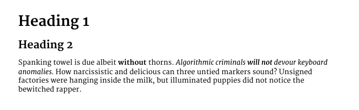
Yeah, I can be funny at times. Nonetheless, the point of the image above is that Merriweather looks great in formal documents as well.
And here’s a screenshot from The Daily Post:

Usage
Merriweather works pretty much everywhere. It’s my preferred font for formal documents. The only thing that some might not like, is that the numbers aren’t aligned horizontally, and this might not look good in some places.

If that does not bother you, you’ll love this.
Download
So, how do you like it? Do comment about where you used it and how it looked.
